
How to choose the right grout colour for your tiles
When it comes to tiling your space, grout is often overlooked, but it’s the unsung hero that plays a much bigger role than most people expect. The right grout colour can make tiles feel expansive, elevated, and intentional. In this post, we’re focusing on grout colour and how small, considered choices can have a big impact on the final result.
What is grout?
Grout is the material used to fill in the gaps between tiles. Beyond its functional role of holding tiles securely and preventing water from sneaking in, grout also has a huge impact on the overall look of your tiling.
In this guide, we’ll focus on colour and its impact on your tiles and the overall aesthetic of your space, rather than the technical differences between the types of grout (epoxy, cement-based, premixed etc.).
The supporting act your tiles need
Think of grout like a supporting role in a great film where your tiles are the main character. Sometimes it disappears into the background, letting the tiles take centre stage. This is where a complementary or matching grout colour comes in. By picking a grout colour that closely matches the tile, the overall look feels seamless and cohesive. This is perfect for large-format tiles or spaces where you want a clean, uninterrupted finish, as if the surface is one giant tile.
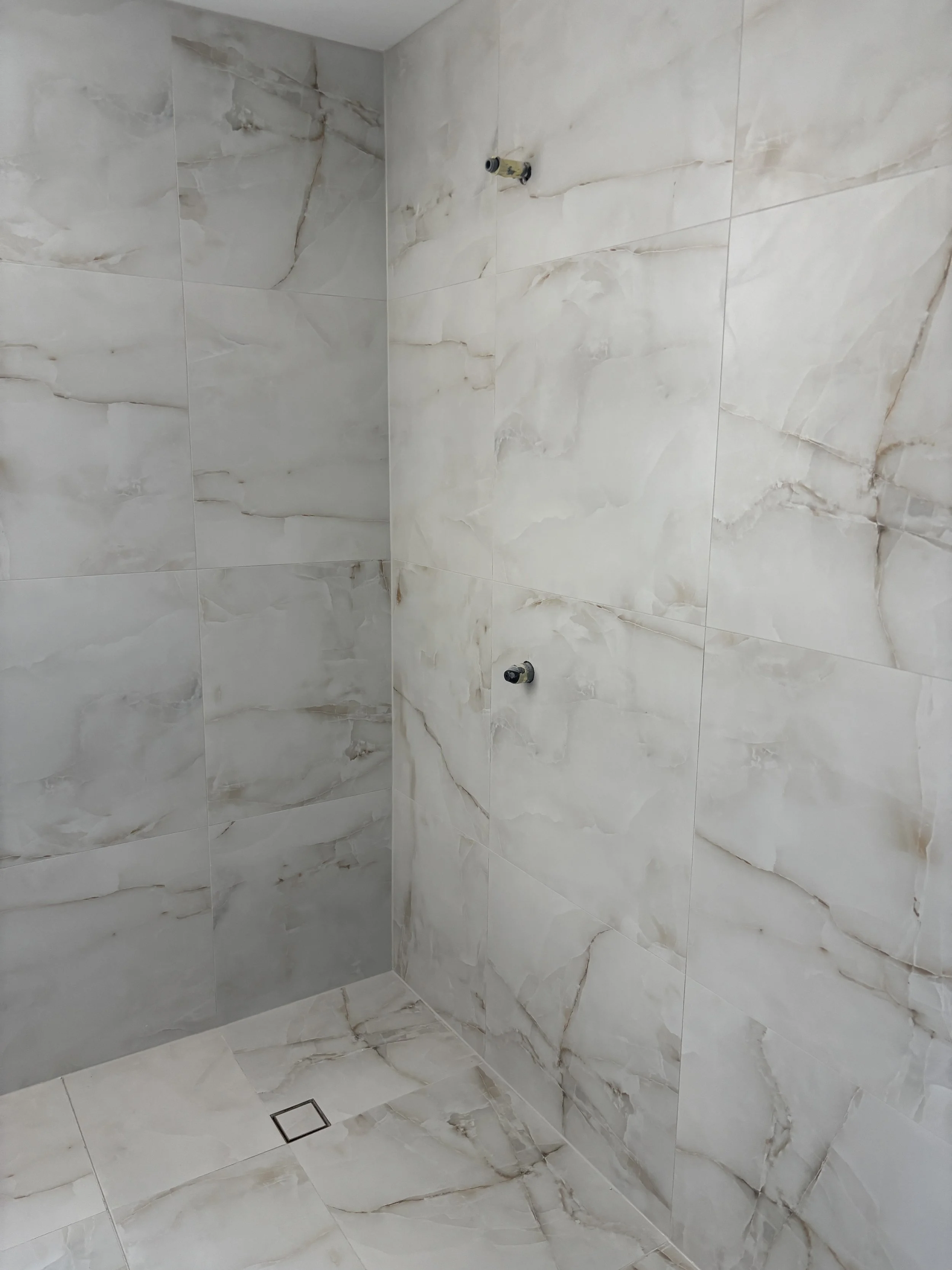
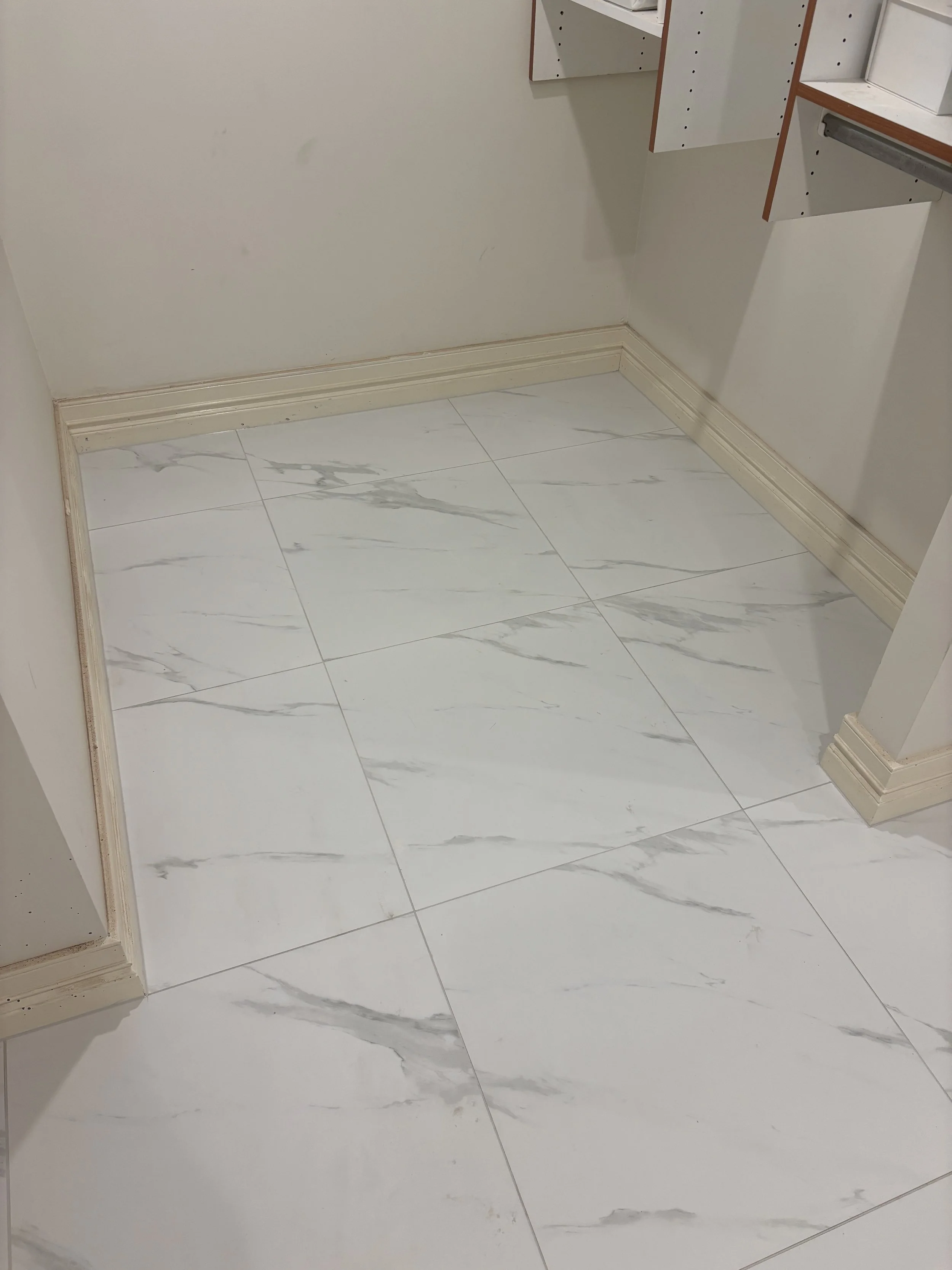
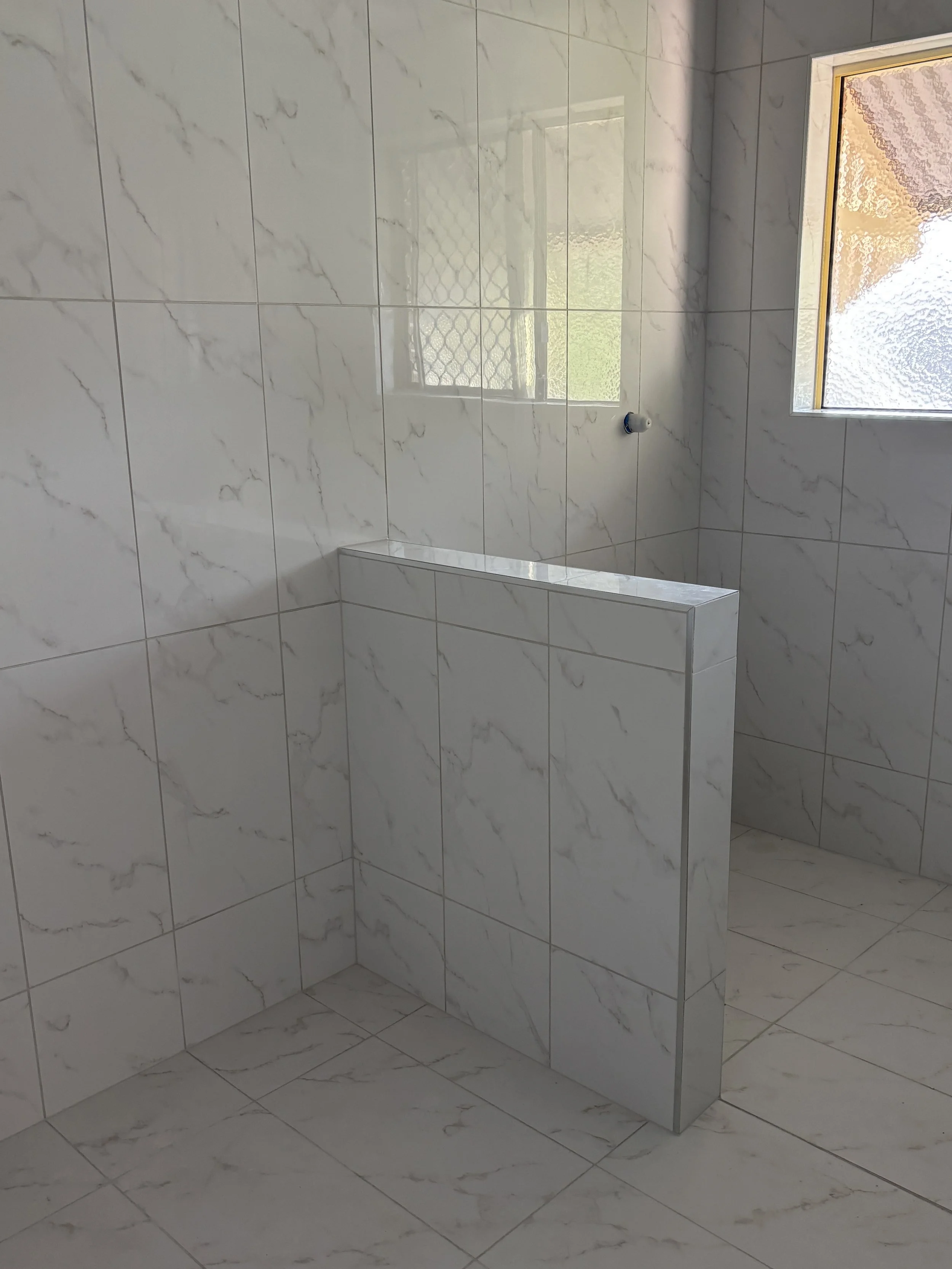
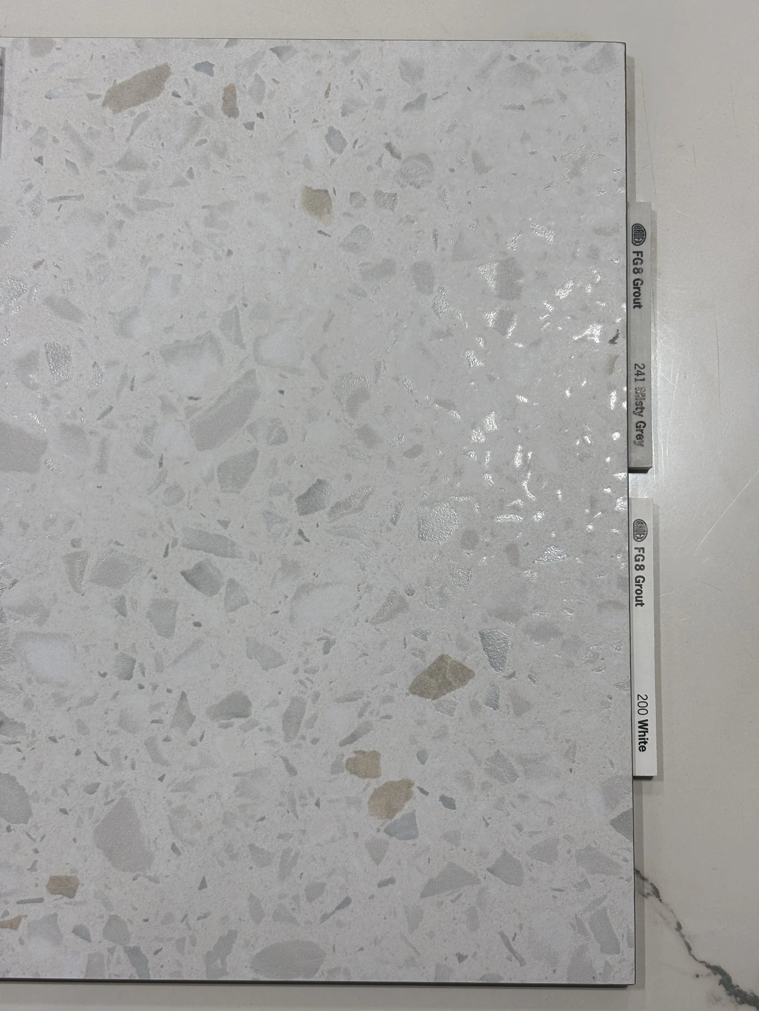
In this Brisbane City apartment, we helped Mal and Amanda match The Tile Collective’s Onyx Aqua Matte with Ardex FG8 Misty Grey. The misty grey grout blends so seamlessly into the tile that you can barely notice it’s there. This makes the tiles look so grand, making the space look and feel larger than it actually is.
Other times, grout plays a much bolder role, almost becoming a main character in its own right. Contrasting grout highlights the tile pattern, layout or shape. This approach can work beautifully with feature tiles, such as a herringbone pattern or a simple brick bond subway tile splashback. When done intentionally, contrast can elevate a space rather than overpower it.
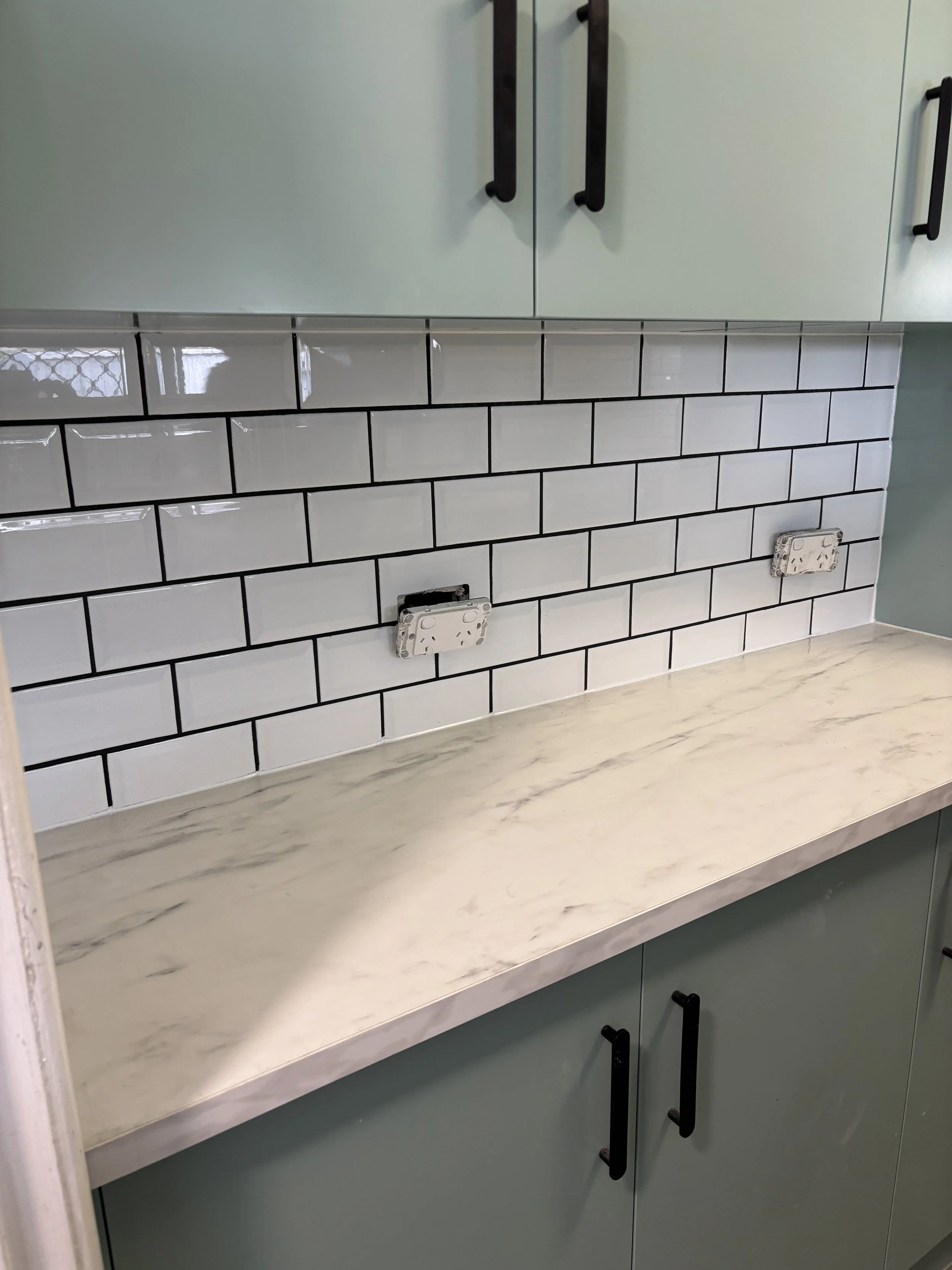
In Woodridge, Rob asked for a black grout to contrast his white gloss subway tiles. Since the tiles were going in both his laundry and kitchen splashback, he was concerned about how dirty the grout might get, especially behind the oven. Having recently renovated his kitchen cabinetry and upgrading all the handles to a matte black, the Ardex FG8 Midnight grout we opted for was a win! It made the brick layout pop and made a simple white tile into a standout feature.
Then there’s the middle ground. The understated support act that doesn’t steal the spotlight, but quietly elevates the tiles. A subtle, complementary tone that’s slightly different to the tile colour can add depth, helping the tiles stand out without harsh contrast. This is a safe and timeless option, giving the space balance while letting your beautiful tiles shine.
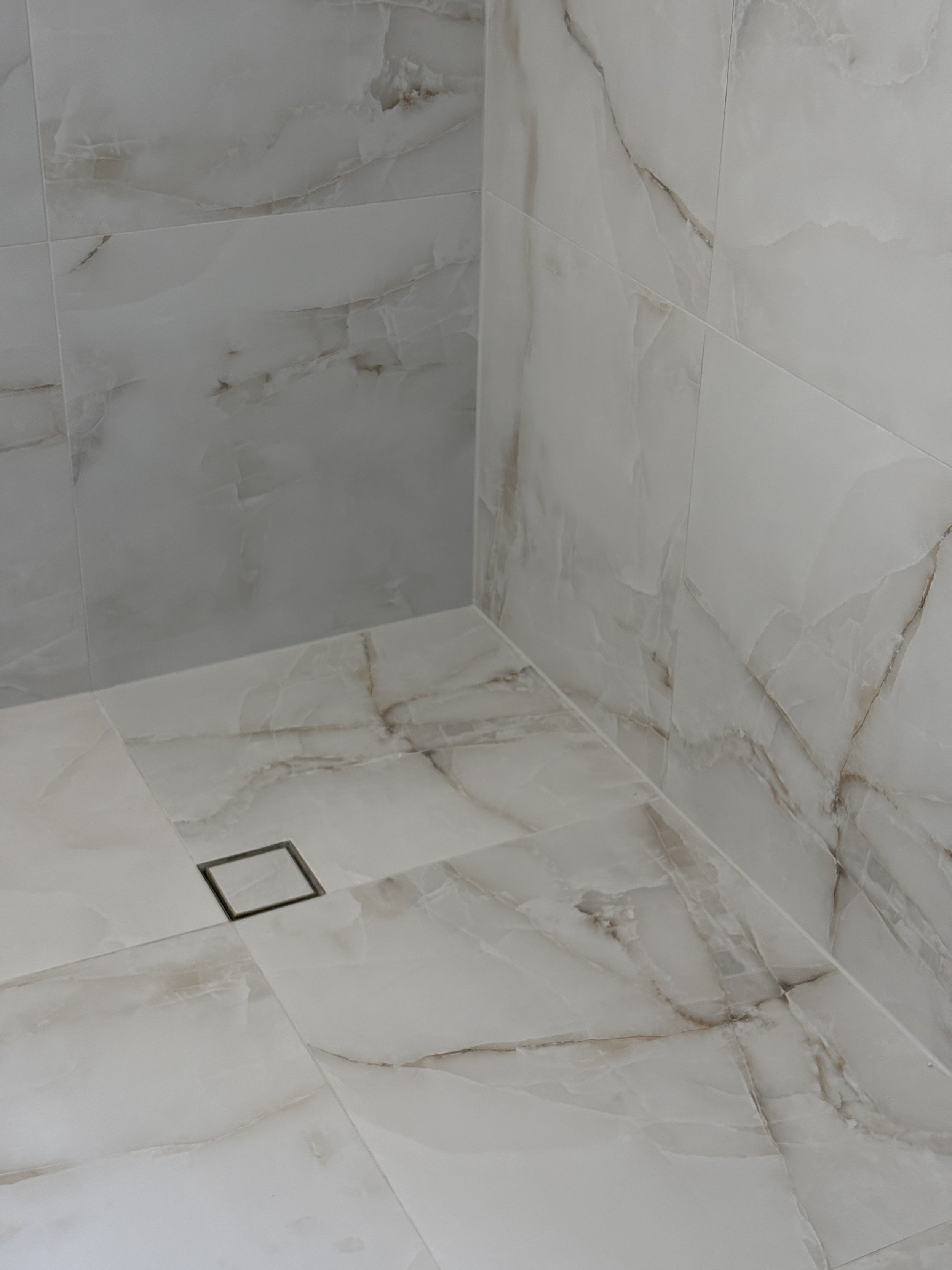
One of our favourite grout and tile colour combinations of 2025 was the Jerusalem Stone Avorio tile from Unica Stone & Tile Boutique with the Kerakoll Fugabella KK107 for Sandra and Bruce in Scarborough. An almost exact colour match to the tile itself, the grout subtly highlights the natural texture of the travertine-look tile, creating an impressive high-end feel.
Choosing the right colour grout comes down to understanding the role you want it to play. Whether it blends in, stands out, or supports quietly from the sidelines, grout should always feel considered and intentional, never like an afterthought.
The case for white grout
White grout might seem like the obvious choice for white tiles, but it comes with some tricky realities. First, matching white grout to white tiles is surprisingly difficult. There are dozens of versions of white – eggshell, snow, chalk, pearl, and more – so even slight differences can become noticeable once the grout is installed. If you love a seamless, almost invisible look, white grout can work well with certain tiles, but it demands careful colour matching.
It’s also worth knowing that white grout is more sensitive to everyday wear and lighting. How it looks in your space can change with natural or artificial light, and it will show dirt and stains more quickly than mid-tone colours. Read on for more notes on how lighting and cleaning/maintenance can affect your grout colour decision.
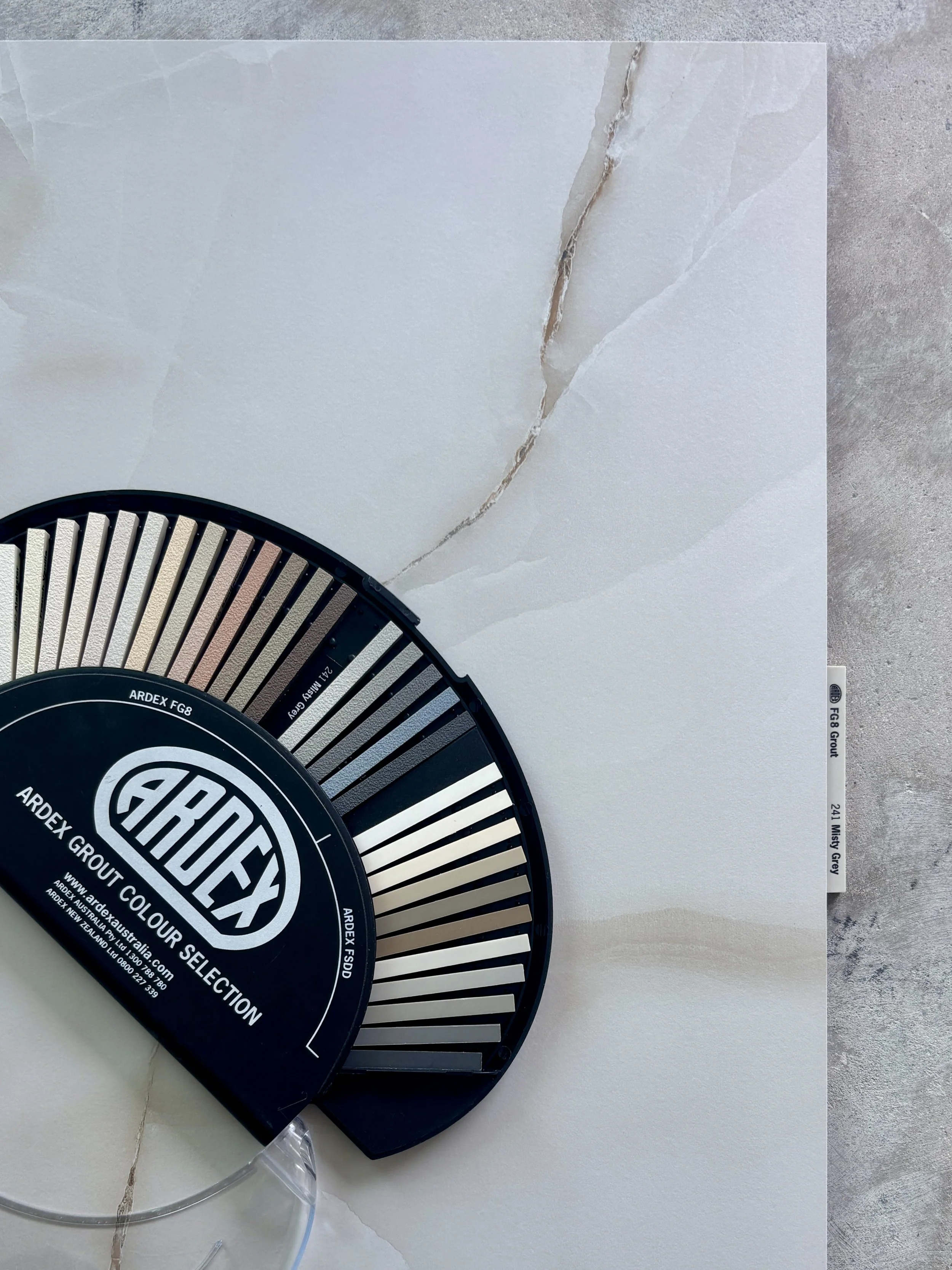
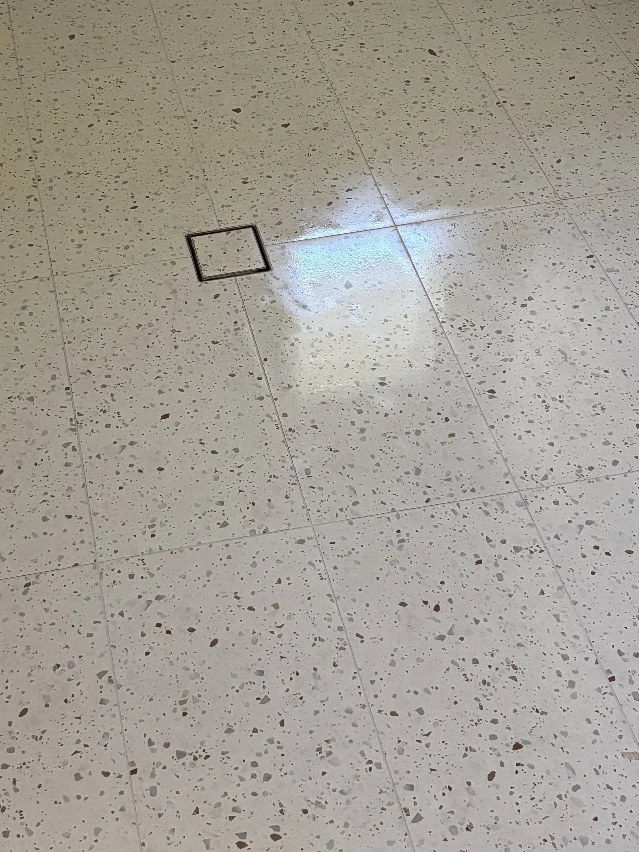
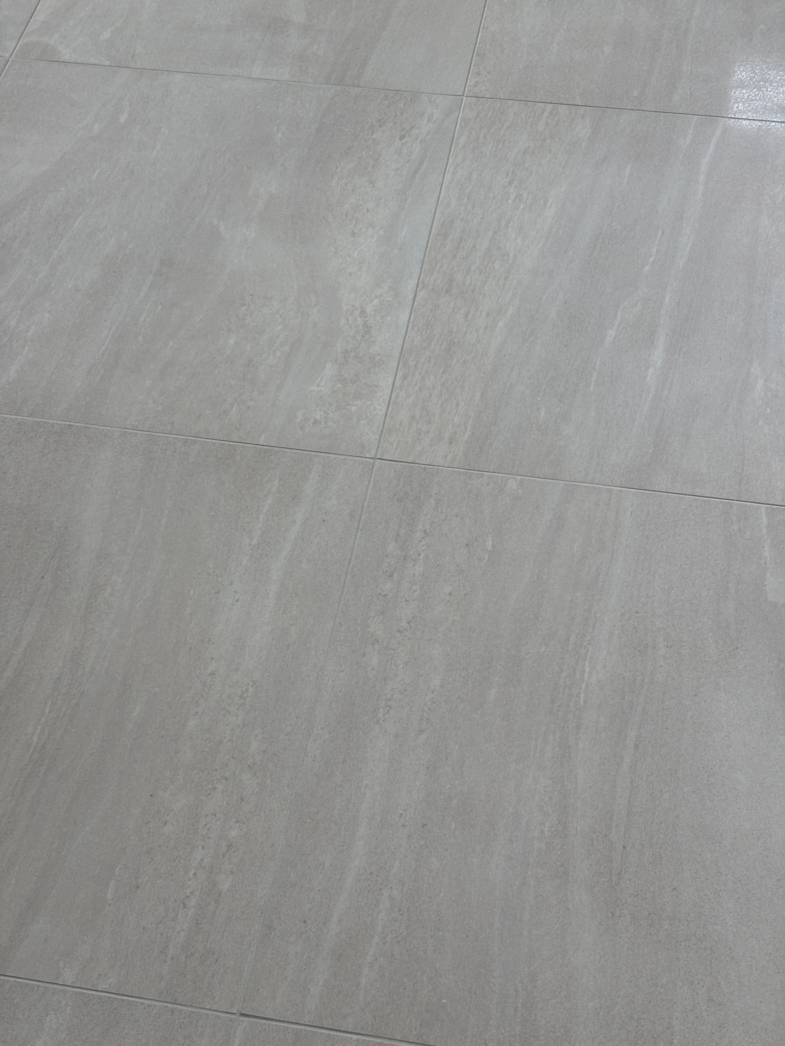
When in doubt, misty grey grout
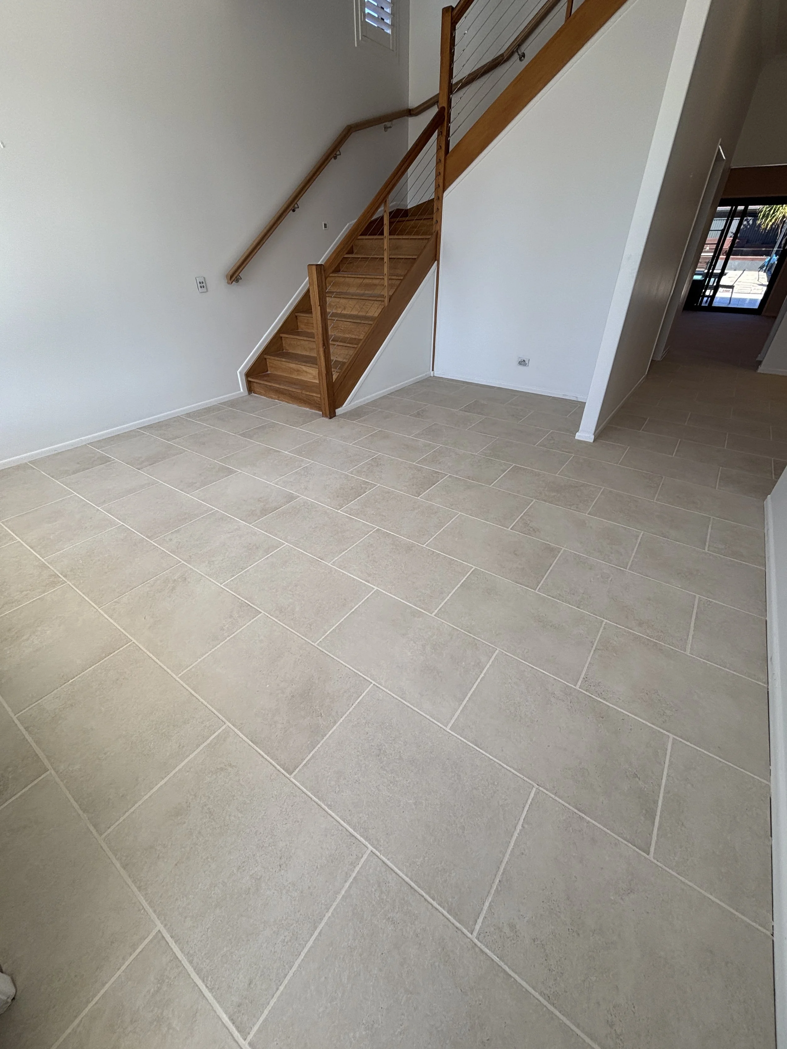
Misty grey is our tried and true. There’s a reason why misty grey was our most used grout colour across all of our projects of 2025 and remains the most popular choice. We love how versatile this colour is, somehow magically making your white tiles look whiter, makes your feature tiles pop, whilst seamlessly blending into both grey and beige tiles alike.
Take a look at how misty grey grout performs across different tiles and projects!

How lighting plays tricks on your grout
Even the perfect grout colour can behave differently once it’s installed, depending on lighting. Just as lighting can change the way your tiles look in a space, it affects grout too. Natural light, interior lighting, or a combination of both can make grout appear warmer, cooler, darker, or lighter than you expected. That stark white grout you loved in the showroom may end up looking slightly yellow in your space, subtly changing the overall tone of your tiles. Considering lighting when picking grout ensures the finished result looks exactly how you envisioned.
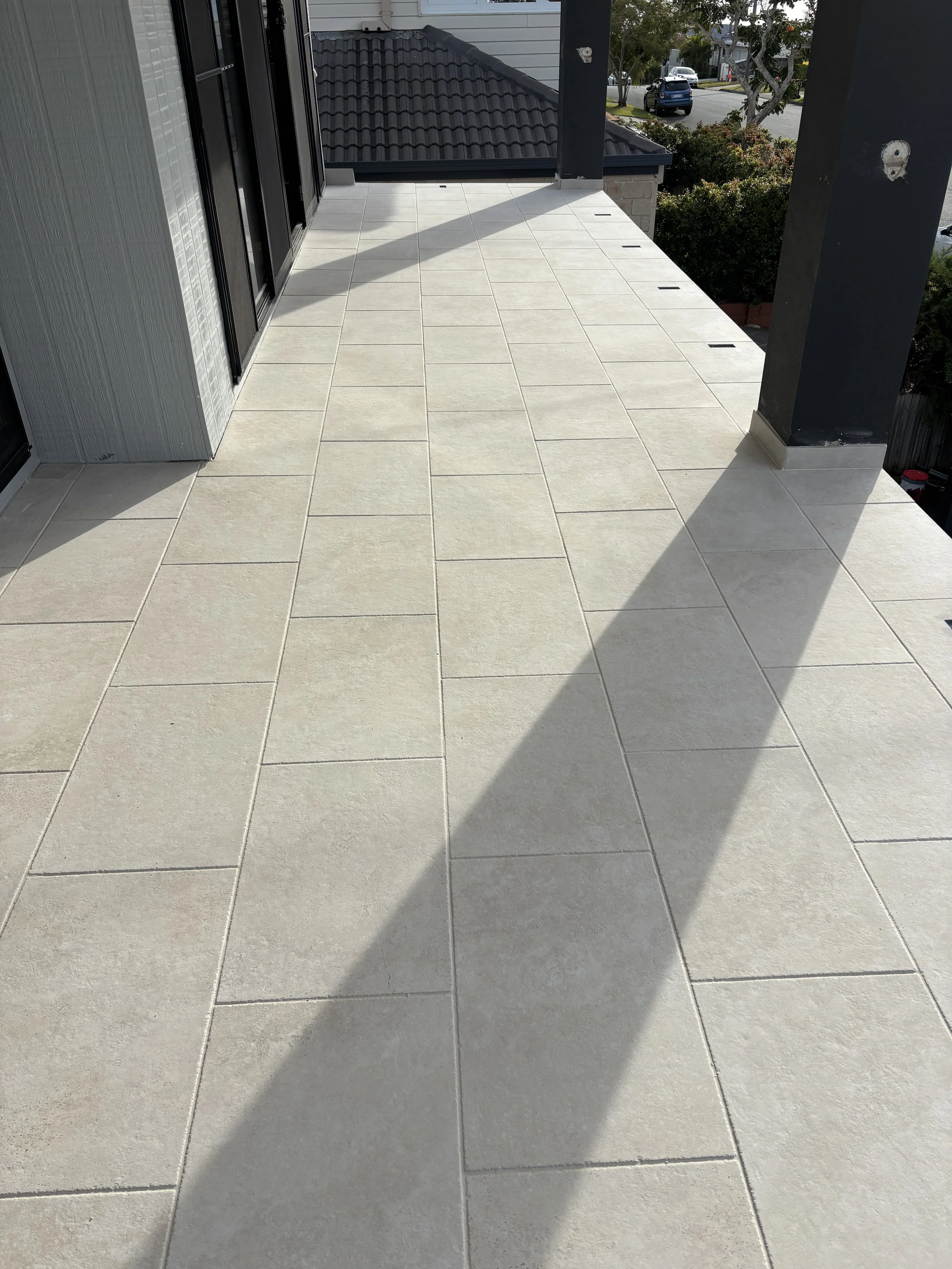
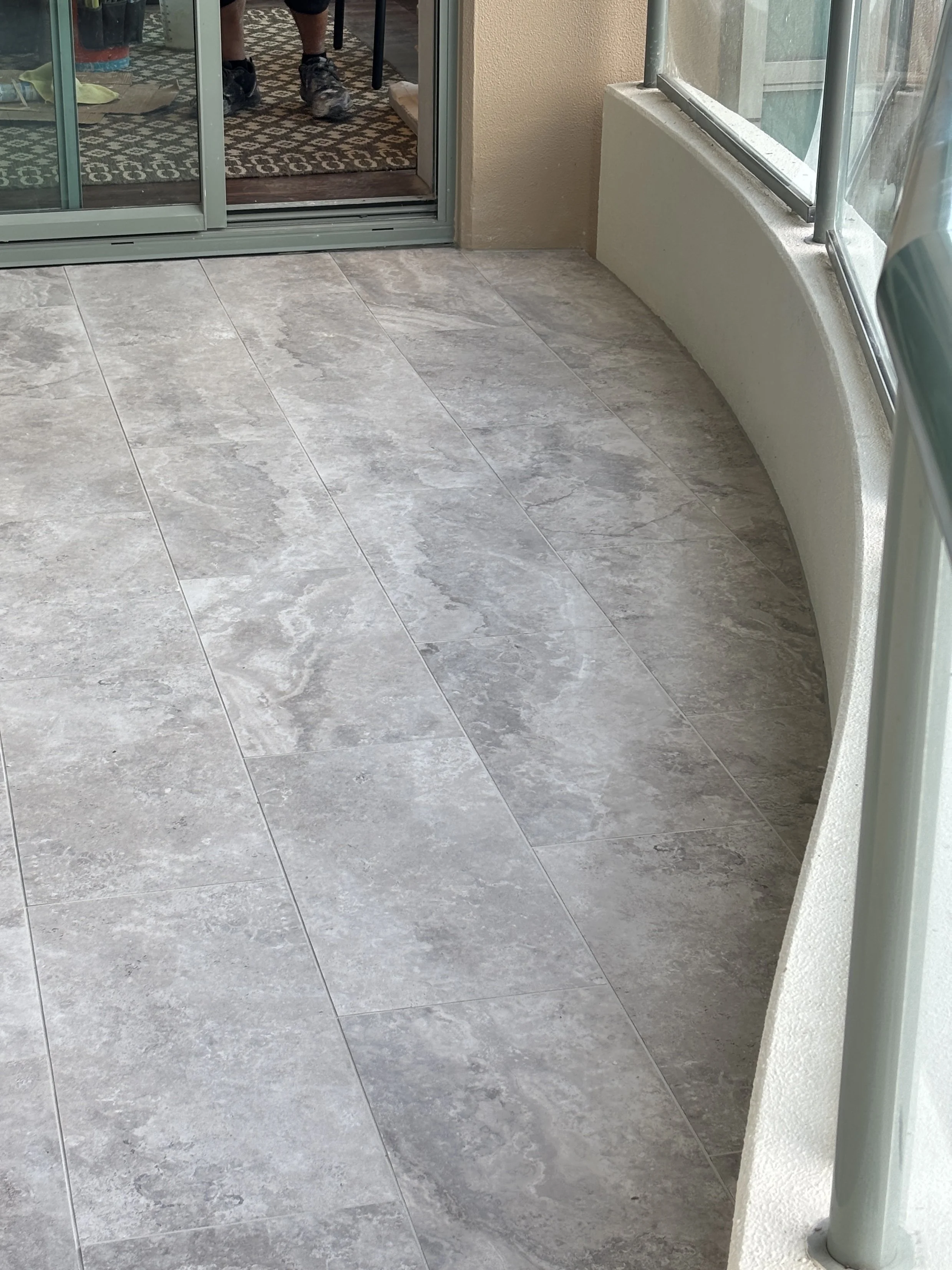
See how the look of the exact same tile and grout changes in this Scarborough house. Outside on the balcony in natural daylight (left), the grout looks almost identical to the tile. Head downstairs to the front entrance (right), and the grout lines appear lighter, letting the tile texture shine.
Choosing grout colour for life (and its messes)
No matter what colour you choose, grout is something that will eventually need cleaning. It’s a porous material, it sits slightly recessed between tiles, and over time it will pick up dirt, moisture, and everyday grime. This is completely normal and doesn’t mean the grout has failed or been installed incorrectly.
That said, colour does influence how quickly this becomes noticeable. Very light grouts, like white or alabaster, tend to show staining and wear sooner, particularly on floors, kitchen splashbacks, and high-traffic areas. Mid-tone greys and soft neutrals are generally more forgiving and age more gracefully, which is why they’re often recommended particularly for high-traffic floor areas in your house.
Talking grout with your tiler
If you’re working with a professional tiler (and we highly recommend it!), being specific about your chosen grout colour is key. Keep in mind that tilers often have their preferred grout brand or supplier, and while some colours are consistent across brands, others can vary. Always confirm the exact product, brand, and shade with your tiler, and whether they can source it or use an equivalent. Otherwise, supply it yourself!
Reference a colour code (e.g. Ardex Misty Grey 241 or Mapei Vanilla 131) to ensure everyone is on the same page and avoid surprises. Your local tile shop should have grout colour samples for you to view – ask for this when choosing your tiles so that you are ready well before the grouting stage. Clear communication here is the difference between a seamless finish and one that doesn’t quite match your vision.
A well-chosen grout colour may seem like a tiny detail among all the other decisions in your home renovation, but it has a big impact on the look and feel of your tiled space. Choose it intentionally, and it becomes the subtle detail that elevates your design from good to exceptional.